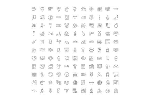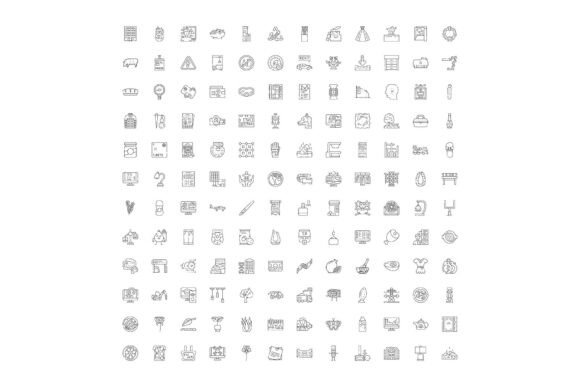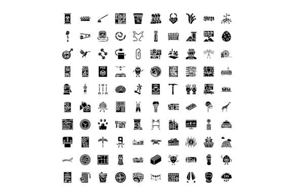
Universal Icon Set: 100 Black-and-White Glyph Icons for Desi & Modern Design
Icons are the silent language of digital and print communication — small, scalable, and instantly recognizable. In today’s fast-paced visual landscape, where attention spans are short and clarity is non-negotiable, a well-crafted icon set does more than decorate a page: it guides users, reinforces meaning, and bridges cultural and linguistic gaps. Enter the Universal Icon Set — a thoughtfully curated collection of 100 black-and-white glyph icons designed to reflect both contemporary global aesthetics and authentic Desi identity. Whether you're building a food delivery app in Mumbai, designing an eco-awareness campaign in Lahore, or crafting educational infographics for rural schools in Bangladesh, this set meets real-world needs with elegance and inclusivity.
What Makes This Icon Set Truly Universal?
“Universal” isn’t just a marketing term here — it’s a design philosophy rooted in accessibility, versatility, and cultural resonance. Unlike generic icon libraries that default to Western-centric metaphors (e.g., a mailbox for “contact” or a floppy disk for “save”), this set intentionally integrates symbols familiar across South Asia and beyond — think chai cups, hand-fans (pankhas), diyas, coconut trees, and handloom motifs — while also supporting universal tech and lifestyle concepts like cloud storage, Wi-Fi, solar panels, and mobile notifications.
Each icon is:
- Monochrome by design — optimized for legibility at any size, from tiny mobile buttons (16×16 px) to large-format print posters;
- Flat and minimalist — aligned with modern UI/UX best practices, ensuring fast loading, easy theming, and seamless integration into dark/light modes;
- Culturally grounded yet globally legible — balancing specificity (e.g., a thali representing nourishment or community meals) with abstraction (e.g., a stylized peacock feather symbolizing beauty and heritage);
- Consistently engineered — uniform stroke weight, spacing, and optical alignment across all 100 glyphs, so they work harmoniously in grids, dashboards, and navigation bars.
Why Black-and-White Glyphs Still Matter in 2024
You might wonder: in an age of vibrant gradients and animated Lottie files, why choose monochrome glyphs? The answer lies in function over flair. Black-and-white icons offer unmatched flexibility:
- Adaptability — They accept any color via CSS fill, SVG filters, or print ink without losing fidelity;
- Accessibility — High contrast ensures WCAG AA/AAA compliance when used against appropriate backgrounds;
- Performance — Tiny file sizes (<5 KB per SVG) mean faster page loads and smoother interactions — critical for low-bandwidth regions and progressive web apps;
- Timelessness — Color trends fade; clean line art endures. These icons won’t feel dated in 2027 or 2032.
A common misconception is that monochrome = minimal effort. In truth, crafting expressive, unambiguous black-and-white icons demands deeper design discipline — every curve, angle, and negative space must communicate intent without crutches like color or texture. That’s why each glyph in this set underwent multiple rounds of user testing across age groups and geographies — from college students in Chennai to senior educators in Kathmandu — to verify intuitive recognition.
Educational Tools & E-Learning Platforms
Teachers and edtech developers use these icons to simplify complex topics. For example, a climate science module might pair a monsoon cloud icon with rainfall data, while a history lesson on textile traditions could feature a spindle and yarn glyph beside timelines. Because the icons avoid jargon and rely on shared visual memory, they support multilingual learners and reduce cognitive load — especially valuable in India’s 22 officially recognized languages.
Healthcare & Public Service Infographics
In public health campaigns — such as maternal care awareness or diabetes prevention — clarity saves lives. A hands-washing icon styled with South Asian hand gestures (palms up, fingers slightly curled), or a neem leaf representing natural wellness, conveys trust and relevance far better than stock clipart. These icons appear in printed pamphlets distributed through ASHA workers, as well as in voice-assisted mobile interfaces for low-literacy users.
Tech Startups & SaaS Dashboards
Founders building tools for local markets often struggle with icon localization. Instead of translating “settings” into Hindi, Marathi, or Tamil text — which clutters UI — they use a universally understood gear icon, reimagined with subtle Indian craft patterns in its teeth. Similarly, a banking app may display transaction status using a rupee symbol fused with a checkmark, reinforcing both function and regional familiarity.
Cultural Preservation & Creative Projects
Designers, filmmakers, and NGOs use these glyphs to tell stories without words. A documentary about folk music might use a tanpura outline as a chapter divider; a sustainable fashion brand could embed a khadi cloth texture into its “eco-friendly” badge. These aren’t decorative flourishes — they’re intentional acts of representation.
How It Fits Into Broader Design & Digital Trends
This icon set aligns with three major shifts shaping how we build and consume digital content:
- Inclusive Design Maturity — Moving beyond “one-size-fits-all” to embrace pluralism in form, meaning, and context;
- Performance-First Development — Prioritizing lightweight assets that respect device capabilities and network constraints;
- Contextual Localization — Recognizing that translation isn’t just linguistic — it’s visual, emotional, and experiential.
It also supports emerging practices like design systems and component-driven development. Each icon ships as a ready-to-use SVG, React component, Figma library, and printable PDF — making adoption frictionless for designers, developers, and non-technical stakeholders alike.
Common Misconceptions — Clarified
Myth: “Desi-themed icons only appeal to South Asian audiences.”
Reality: Cultural specificity enhances universality — think of the global recognition of sushi, yoga, or origami. These icons introduce new visual vocabulary to worldwide design conversations, enriching rather than limiting scope.
Myth: “Black-and-white means boring or outdated.”
Reality: Monochrome is the foundation — not the ceiling. These glyphs serve as canvases: add color, animation, or layering to match your brand, but start from a place of structural clarity.
Myth: “Icons replace explanation.”
Reality: Icons complement text — they don’t substitute for it. This set includes clear naming conventions and usage guidelines (e.g., “Use ‘chai cup’ only for beverage-related actions, never for ‘break’ or ‘pause’”) to prevent ambiguity.
Getting Started — Practical Next Steps
Whether you’re a solo designer, a startup CTO, or a government communications officer, integrating this set is straightforward:
- Download the full pack — includes SVG, PNG (1x–3x), and font formats;
- Explore the searchable online gallery — filter by category (e.g., “Nature”, “Festivals”, “Digital Tools”) or keyword (“water”, “justice”, “rice”);
- Test in context — drop icons into your Figma wireframe or HTML prototype and observe how they behave across devices;
- Customize responsibly — adjust stroke width or corner radius to match your system, but preserve semantic integrity (e.g., don’t rotate the lotus icon 90° — orientation carries symbolic weight).
And remember: icons are most powerful when they’re part of a larger ecosystem of thoughtful design — consistent typography, inclusive language, and user-centered workflows. This set doesn’t do the work for you — but it gives you 100 trustworthy, culturally intelligent starting points.
From classrooms to codebases, from village health centers to venture-backed platforms, the Universal Icon Set proves that great design doesn’t shout — it listens, reflects, and connects. And sometimes, the clearest message is drawn in black and white.